Visuals Spotlight: B Corporation DAME - the first reusable tampon applicator
Have you heard of DAME? They are a personal care brand that has created the first reusable tampon applicator as an alternative to single-use plastic applicators. DAME is committed to reducing the personal care environmental footprint: 100 billion period products that nearly all contain plastic are thrown away every year. DAME are certified carbon negative and a B Corporation company. They’re based in the UK (and ship worldwide).
I discovered DAME when I was researching B Corp companies in the UK and have been pretty obsessed since. If we’re friends on Instagram you might’ve seen me post or repost stories about them. You know when a brand hits just the right spot and you’re an instant cheerleader and number one fan? That’s how I feel about DAME.
DAME is doing an incredible job of telling their story and their use of visuals is absolutely spot on. Since launching the business with a Kickstarter campaign in February 2018 and sailing through their £20k goal ending with an amazing £70k of backing they have grown a substantial social media following, garnered media coverage and been nominated for a design award for their product design.
Here are 5 ways that DAME uses visuals - and how you can - to powerfully tell their story, create fans from customers and raise awareness around the plastic problem they’re helping to solve with their product.
ONE - Clean & Minimal
Website: Check out the DAME website homepage! So clean and minimal. Clean, crisp and a no fuss, no mess selection of product photography. Next to images there are minimal amounts of text enabling the viewer to quickly understand who DAME is, the problem they are tackling and the opportunity DAME has created for their audience to get involved with the products on offer and be part of a solution.
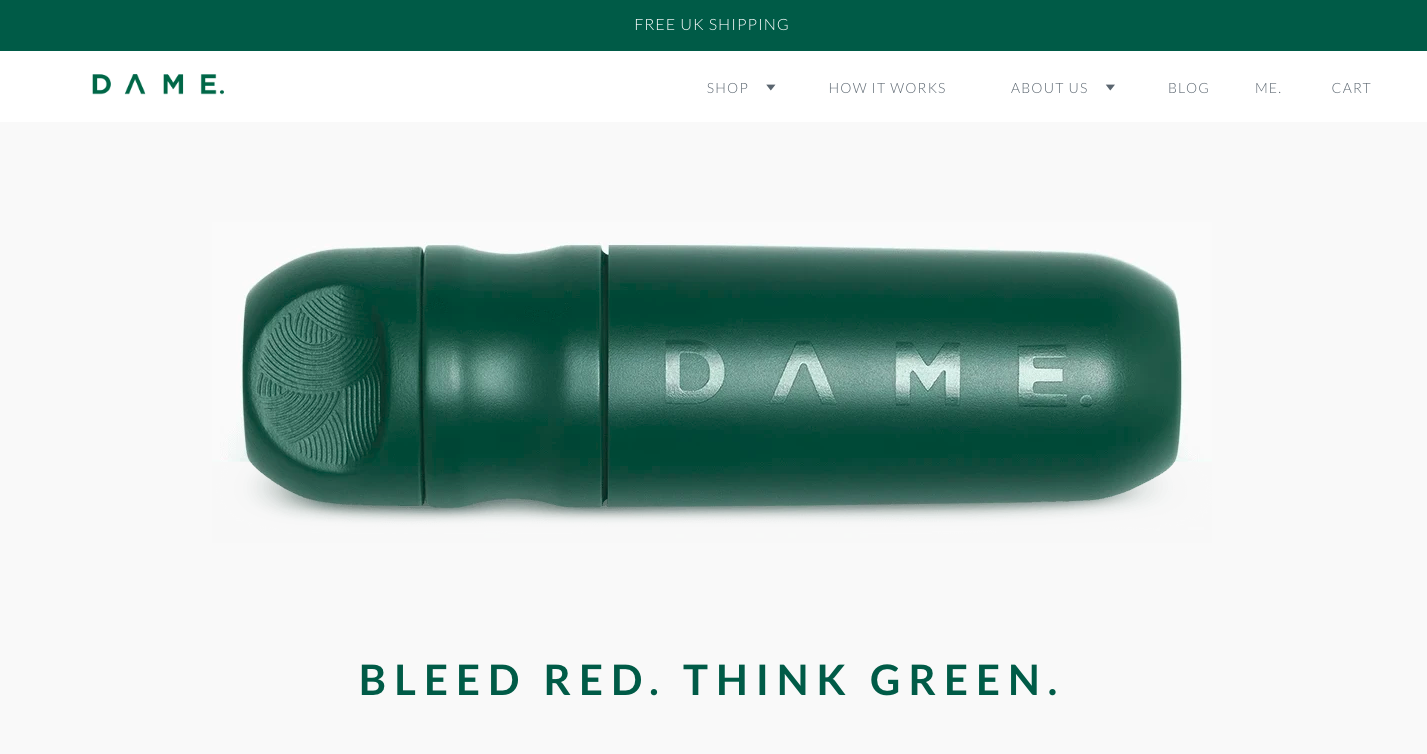
Visuals suggestion for your business: Less is more! Make sure the images you’re putting out and especially on your homepage are all directly related to your core mission. It makes it easy for people to hone in to your business message quickly.
TWO - Colour Theme
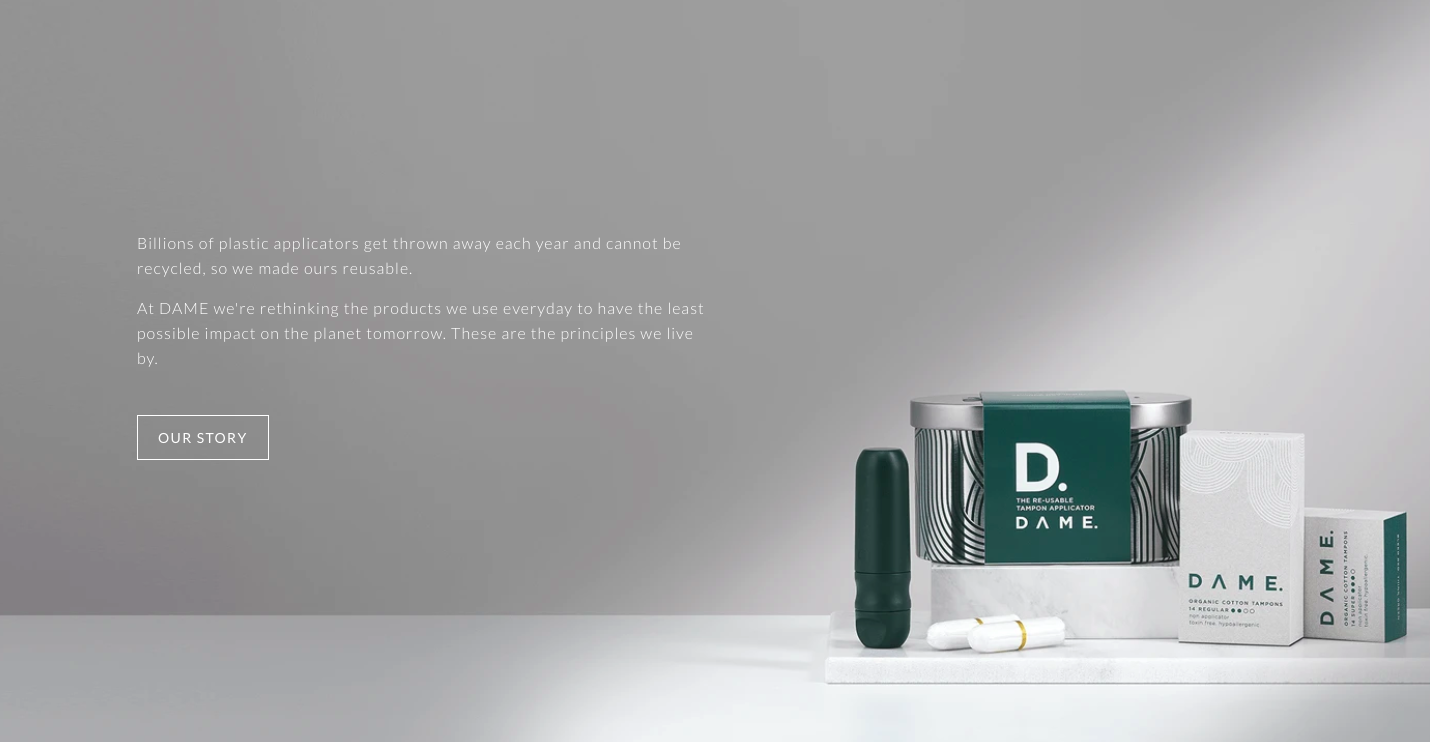
Website & Instagram: “Bleed Red Think Green” is DAME’s tagline, and green is their continuous colour throughout all their branding. It speaks to their mission of minimizing environmental footprint and the love and honour they have for Mother Earth.
The DAME website theme is earthy green, and their Instagram feed has the same tone of green woven throughout which appears either in full blown glory in their Instagram feed squares as a quote background or as a pop of colour in other imagery. This continuous use of the brand colour is a good way to create connection for the DAME audience between the company and anything else they see in the same bottle green colour. It creates a good visual flow, and is visually very pleasing to look at:


Visuals suggestion for your business: Do you have a brand colour palette or logo that you can take inspiration from for a continuous colour to weave into your story telling? One idea to take from DAME’s example is that the colour doesn’t necessarily have to be the absolute tone across all your marketing and restricting in that sense, but can be brought in subtly as one of the colours in the photograph you’re putting out there. Try including your chosen colour into every 3 images you post on Instagram.
THREE - Mixed Media For Visuals
Website & Instagram: DAME uses a mixture of product photography, lifestyle photography and graphics on their website and Instagram. As you can see from screenshots above, the mix of visuals all work really well together in sharing different parts of their brand story:
Here’s a breakdown of the different types of visuals they use across both platforms:
Website:
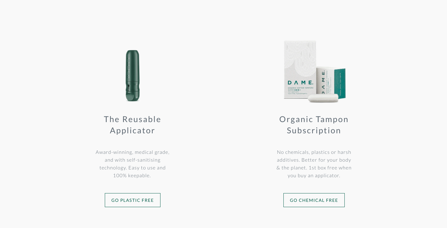
Their own unique product shots
A variety of lifestyle shots sourced from a range of areas and by a number of different photographers
Instagram:
Their own unique product shots
A variety of lifestyle shots sourced from a range of areas and by a number of different photographers
Reposted photos from their customers: ‘DAMES’
Resposted graphics and drawings on aligned topics
Quotes, stats, announcements using their signature brand green as a background colour
DAME has had their own product shots done, and crowd sources the rest of the imagery they use across website and social media.
Mixing up different types of visuals works really well for DAME. It keeps things varied and allows for a range of storytelling including brand accomplishments (award nomination!), facts and figures about plastic pollution and the difference they are making (and you can make as part of their community!) and are all linked together through the same green theme.
Visuals suggestion for your business: If creating your own set of personalised images is not on the cards right now, consider creating a subsection/smaller set of images that you can use to start building out one or two parts of your story. (see here for suggestions of the stories you can pull out and tell with visuals with your business)
FOUR - Positive Encouragement Between Imagery And Wording
One of the reasons I love the DAME brand is the language they use alongside their beautiful visuals. It’s straight to the point with a clear message and call to action, and they use empowering, no-nonsense and often tongue-in-cheek language and visuals around menstruation.
They’ve also created a sense of empowerment and a call to action around plastic use. There’s no shaming people about their plastic use but instead positive action-oriented messaging and how we can make a difference with the plastic problem. As they share in one Instagram post “the world is changed by your example not by your opinion”:

Visuals suggestion for your business: How can you share about your customers and fans that will have them feel empowered and engaged about being part of the problem your business is taking action on?
FIVE - An Emphasis On Design Of The Product Through Wording And Visuals
The DAME applicator started life as a Kickstarter campaign, and has had a focus on the design of the DAME products. It has been designed by medical engineers and is built to last. Compared to a single use plastic applicator, the shame of the DAME product has been tweaked to perfection, there is antimicrobial cleaning technology and heat resistance for easy sterlizing. The product design was nominated for a Dezeen Design Award in its launch year 2018.
DAME regularly use photography and graphics to share this part of the story. And by sharing this in different ways frequently they keep this piece at the top of mind for their audience / fans.
Visuals suggestion for your business: What is unique about your business that you can share with your audience and create engagement around? How can you highlight awards, nominations and acknowledgement that your brand receives?
Maxine is a photographer based in Vancouver, Canada, and works with small heart-centered businesses to create joyful, honest images so they can show up on-brand, and aligned with their values.