Part 2 - Effective Photography Spotlight: Facilities Management Services
Hey! Ready to get inspired by another business who uses photography to tell their brand story in a super effective way?
Before we dive in, I want to share my ongoing surprise during the research I’ve been doing around this. I have a running spreadsheet of organisations I’ve found or have been forwarded who have great visuals and it is pretty crazy the number of websites I’ve come across that either don’t have any visuals or use visuals in an ineffective and unengaging way!
I feel very passionately about the difference that strong visuals make - and I’m going to focus on photography as that’s my wheelhouse but please know I mean all visuals including video, design work, infographics and the rest.
Here’s a look at a business that in my opinion has done a beautiful job of using photography effectively. We’ll take a look at why it is effective and what other businesses can learn from this to use photography powerfully and effectively for themselves.
Facilities Management Services
Facilities Management Services is a professional cleaning services company that services over 10 million square feet of space every day which includes stadiums, high-rises, hotels, hospitals, restaurants and retail stores. They were originally established in 1992, are based in Kentucky in the States and employ hundreds of team members in multiple states and cities. They’ve been B Corporation certified since 2016 - a certification that shows they are company operates with high standards of transparency, accountability, and performance.
I love the FMS website - it is bright, clean, crisp and professional-looking.
The first photo you see which appears briefly is of a couple of the FMS team at work cleaning in a building. The photo quickly opens up to this spray bottle aimed at a window.
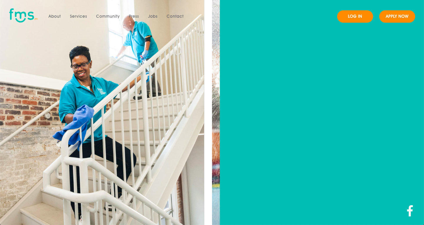
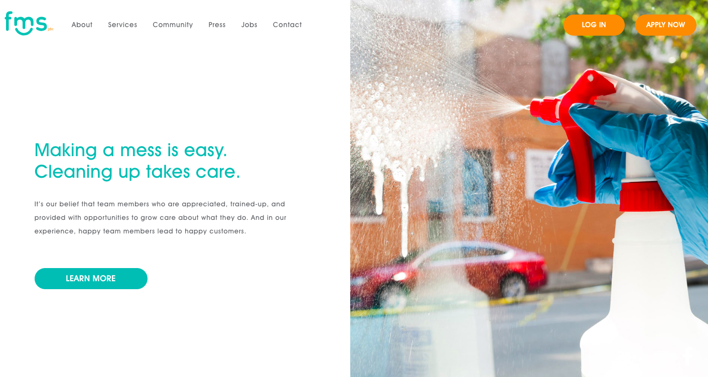
I love the clean-ness of the photo - it is simple and introduces what FMS is in one understandable image. Check out the description next to the image though: it is not really about cleaning is it? It’s about their team, and once you scroll down from here you’re introduced to the team who are the most important asset to FMS. The mixture of photography and short, clear copy highlights that clean buildings are a direct result of good, happy and well-treated staff.
Question for you: what do you feel right now about this brand on initial scroll? ——>
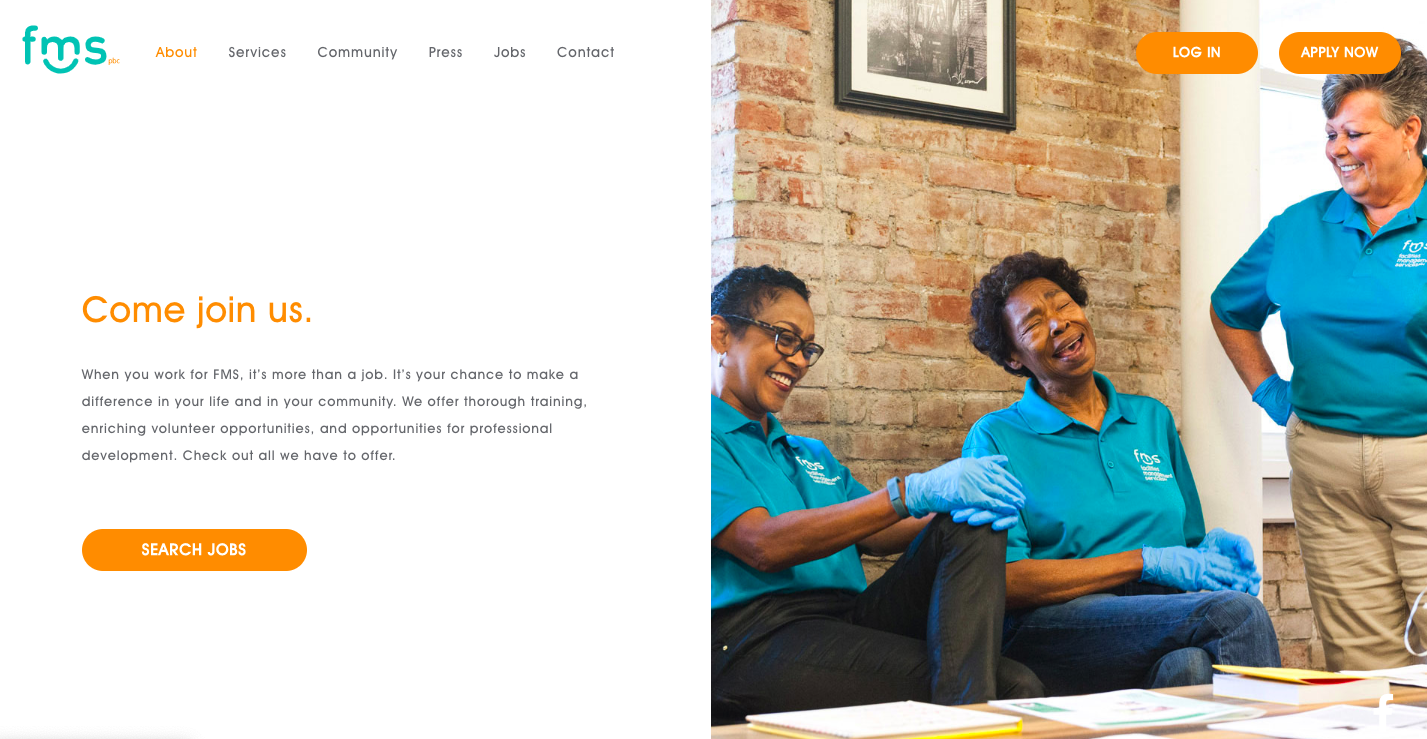
For me - I love seeing their team members. I have an understanding of what this company does. I get the idea that their team’s happiness is important to their success. Also that they take pride in cleanliness and not just the buildings they’re working in and on, but on their appearance with the clean uniforms of their team. Their values are perfectly illustrated through, and although their values aren’t directly listed on the website I would assert that their photography tells us what is most important to them: cleanlines (it has to be!), an engaging and engaged team, a happy kind work environment and community.
What we can learn from Facilities Management Services images:
Consistency is KEY!
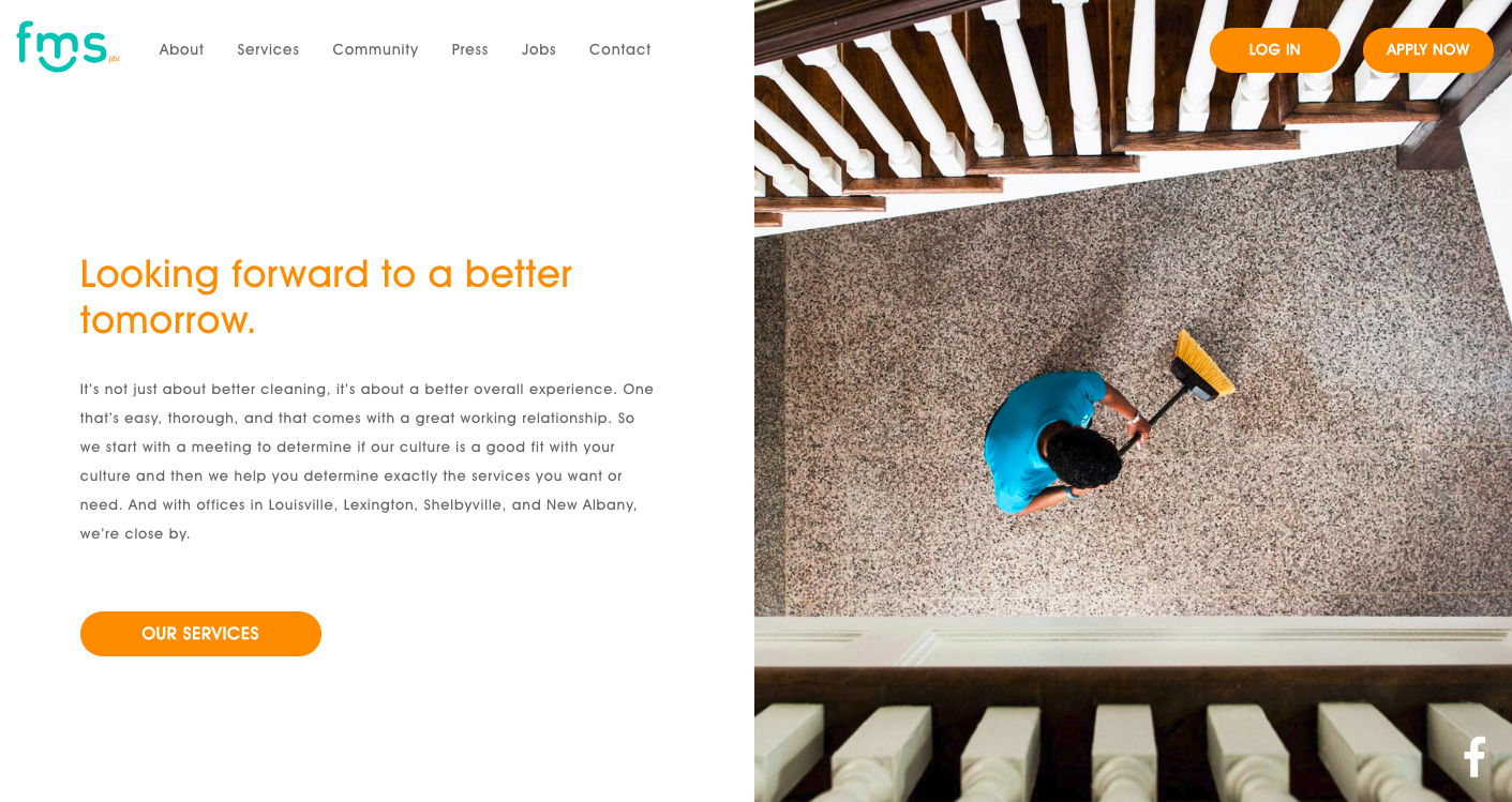
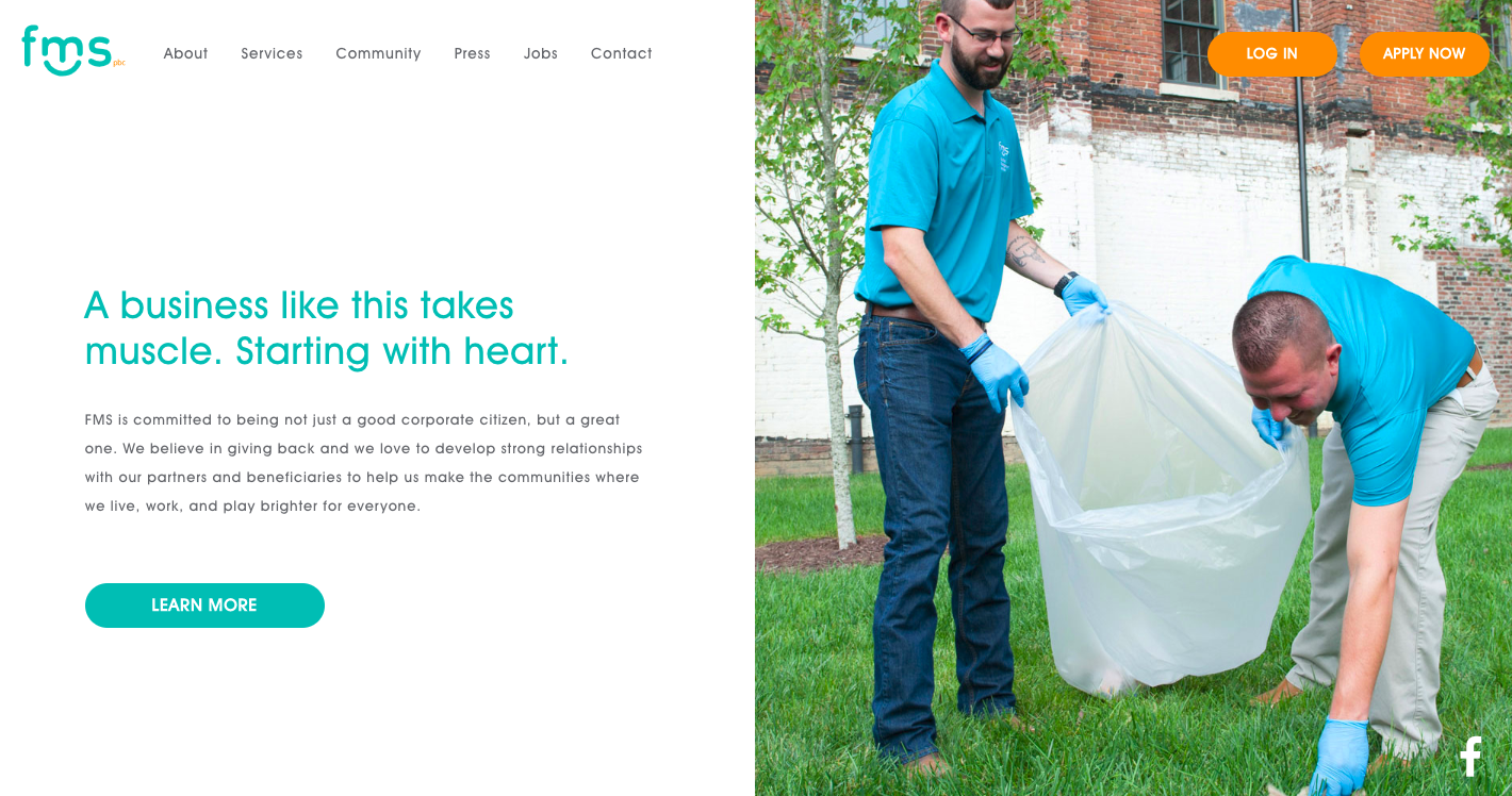
The images have been created especially for FMS and show their branding through the uniforms of their team. They also have a matching colour of cleaning cloth in one of the images...which I’m not sure if they do use regularly or have brought in for the photography - but either way works nicely for cohesiveness. There is lightness and brightness throughout all their imagery. As all images have been taken specifically for FMS and not pulled from a stock library they are all edited in the same style.
Show your team!
Their team is the most important thing to FMS long-running success. They have put great importance on this in their copy, and it is illustrated very clearly with their photography. You get to see the team in different roles, and at different stages of the job - outside, inside, with each other, at work, and connecting with each other. You see their faces, and whatever the photographer has said to get them to smile and laugh and interact is perfect because above all there is a sense of openness.
Want some inspiration for your own brand visuals? Check out this article on 5 ways to tell the story of your brand!
Maxine is a photographer based in Vancouver, Canada, and works with small heart-centered businesses to create joyful, honest images so they can show up on-brand, and aligned with their values.